Driving a Point: Victorian Crash Statistics
Content warning: This post covers road trauma
Introduction
VicRoads has released crash statistics for the calendar years 2010-14 inclusive, so I thought I’d fire up MATLAB and see what I could make of the data. My analysis follows.
Heatmaps: What Happens, When?
Initially, I was interested in the spread of reported incidents throughout the day, and the week. With a nod to Powershop’s cool ability to track energy usage in a similar fashion, I thought I’d generate a heatmap to show when its most likely, on average, for a collision to occur on Victorian roads, for a given time of week.
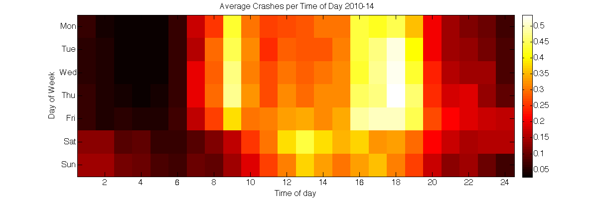
I think this graph speaks to a lot of things, some of them quite interesting. It appears as if the morning weekday rush is a predictable trend, and the corresponding peak-hour drive home its unrivalled partner. However, as the week drags on, (assuming a relatively constant number of drivers across weekdays), tiredness seems to take ahold of the driving populace at a steady and unrelenting rate, extending the bounds of the rush-hour crash envelope until Friday evening merges with Saturday morning, and the causes can less soundly be inferred.
Also worth pointing out is that as these are raw VicRoads incident figures, and therefore not normalised against traffic flows at the time of the incidents, it may be difficult to make much of the changes between weekday and weekend. However, what is interesting is the shift of the peak period of incidence between the two, as well as the relatively constant incidence rate of 8pm.
Worst Case Scenario
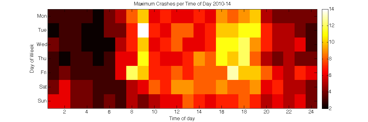
This graph is a conglomeration of the worst of each of the one-hour periods across 2010-14. It’s kind of weird, too; Tuesday 8 am, which has a very low average incidence, is the highest here, with 14. And, looking at the date of these 14 crashes, 2013-05-07, the weather was confoundingly good (a maximum of 21ºC), with only 1mm of rainfall in Melbourne. As this graph is basically a plot of all of the outliers, it’s quite likely to be a good example of strangely high figures for no readily apparent reason.
The Grim:
So far, these graphs have included all types of incidents (where a day of week was given). However, from an exploratory point of view, it would be worthwhile seeing if there was any point of difference between the temporal distribution of all incidents, and those where a fatality arose.
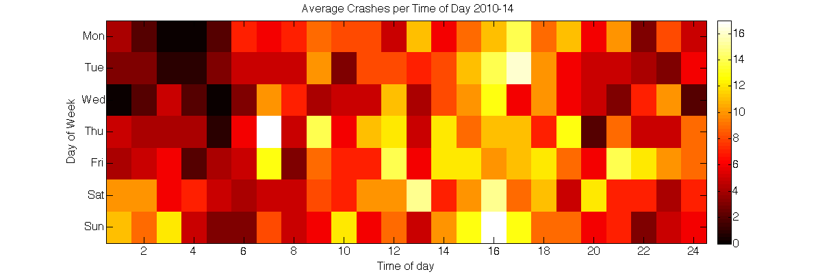
This beggars belief, and is a bit unnerving. Typically, the image of a road fatality conjures (for me) an image of a distracted P-plater, or maybe a bunch of guys driving home from the pub. Given you’re in some sort of accident, that the worst hours to be in one are Thursday 7am and Sunday 4pm is just weird, and pretty contradictory to my idea of the risk factors around road deaths.
The Close to Home: Cyclists
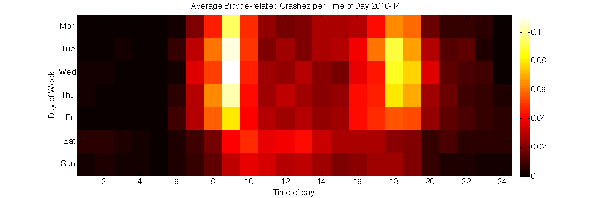
It’s interesting to note the x-wise and y-wise normal-like distributions of this graph; like a game of Tetris with only symmetrical pieces. I’m surprised to see that many more problems occur on Saturday than Sunday, although from my own quick analysis (not shown), 6 300 incidents involved a driver, and only 1 174 did not, suggesting to me that it’s the mixing of recreational cyclists with less abated motorised traffic that results in the Saturday figures. (Obviously no discourse about cycling and road use can be held on the Internet without a comment section; see below, if you must).
Location
Another great feature of the dataset is that it’s geospatial; that is, every incident can be plotted on a map. Like so:
[caption id=”attachment_547” align=”aligncenter” width=”1200”]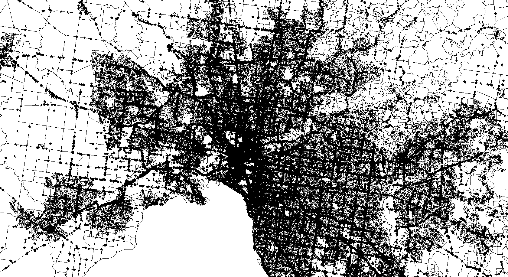 These dots are all incidents over the past 5 years[/caption]
This, combined with census data, can give an idea about the incidence of accidents with respect to immediate population. Sure, this is grossly unfair, but I don’t have the raw traffic data, I have the 2010 census figures. So:
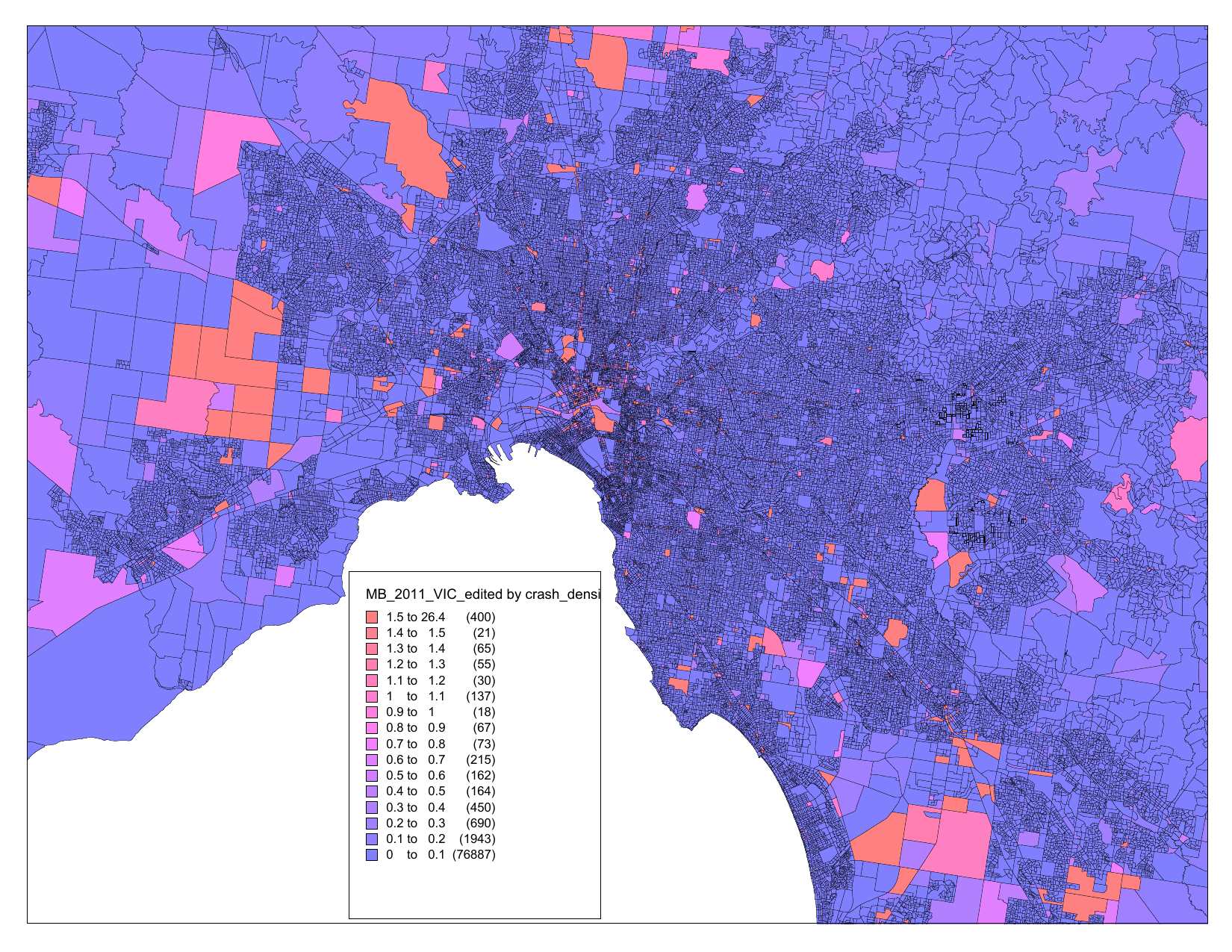
Perhaps unsurprisingly, large expanses of land where there is little population but for passing motorists are likely to be rated as more risky for a reported road incident.
Hit and Runs
Lastly, another aspect of the dataset to pique my interest was the classification of incidents as ‘hit and run’s. It occurred to me that it would be possible to see how likely they are, in the case of an accident, per municipality. The results follow:
| Suburb | Incidents | Hit and Runs | Hit and Run Percentage |
| QUEENSCLIFFE | 11 | 2 | 18.1818 |
| BRIMBANK | 2290 | 198 | 8.6463 |
| PORT PHILLIP | 1435 | 120 | 8.3624 |
| YARRA | 1650 | 133 | 8.0606 |
| MELBOURNE | 4294 | 327 | 7.6153 |
| MORELAND | 2074 | 155 | 7.4735 |
| DAREBIN | 1741 | 126 | 7.2372 |
| DANDENONG | 2402 | 169 | 7.0358 |
| MOONEE VALLEY | 1124 | 76 | 6.7616 |
| MARIBYRNONG | 999 | 66 | 6.6066 |
| WYNDHAM | 1441 | 94 | 6.5232 |
| HUME | 2011 | 130 | 6.4644 |
| MELTON | 975 | 62 | 6.359 |
| HOBSONS BAY | 922 | 58 | 6.2907 |
| FRANKSTON | 1310 | 80 | 6.1069 |
It’s probably unfair to malign the generally lovely Queenscliffe based on this table, as the number of total incidents is quite low compared to other municipalities. Also interesting to see Port Phillip and Yarra, relatively expensive areas for property, very similar to Brimbank, a suburb farther from the CBD.
Conclusion
A lot of these data were unsurprising; the high incidents of accidents at peak time periods, cyclists getting well-damaged on the weekends. But the spread of severe accidents throughout the day has really taken me aback, as well as the ability for 8 terrible things to happen on a relatively dry, clear day. Stay safe out there kids!